5 Easy Steps to Choosing the Perfect Outfits for Family Photos
I know that one of the most stressful things about the whole portrait process is picking the outfits for family pictures. These pictures will be immortalized for all time and you want something that shows you and your family at its best. I will be honest here and say that a portrait can be great without perfectly curated outfits, but it will be over the top with outfits that coordinate and complement each member of the family. That’s a difficult feat though. It’s one of the reasons that I do focus on outfits for the family pictures I’m taking and the ones that I am personally in. As a photographer, I work to be the best resource for my clients when it comes to outfits. This is one of the main reasons why I utilize the outfit online platform, Style and Select, for my full portrait sessions and provide style guides for my mini sessions. I strive to help my families as much as possible. So here’s five steps I would recommend you follow to pick your family’s outfits for your family pictures regardless of the family photographer you choose.
Step 1: Choose a Location for your Family Pictures
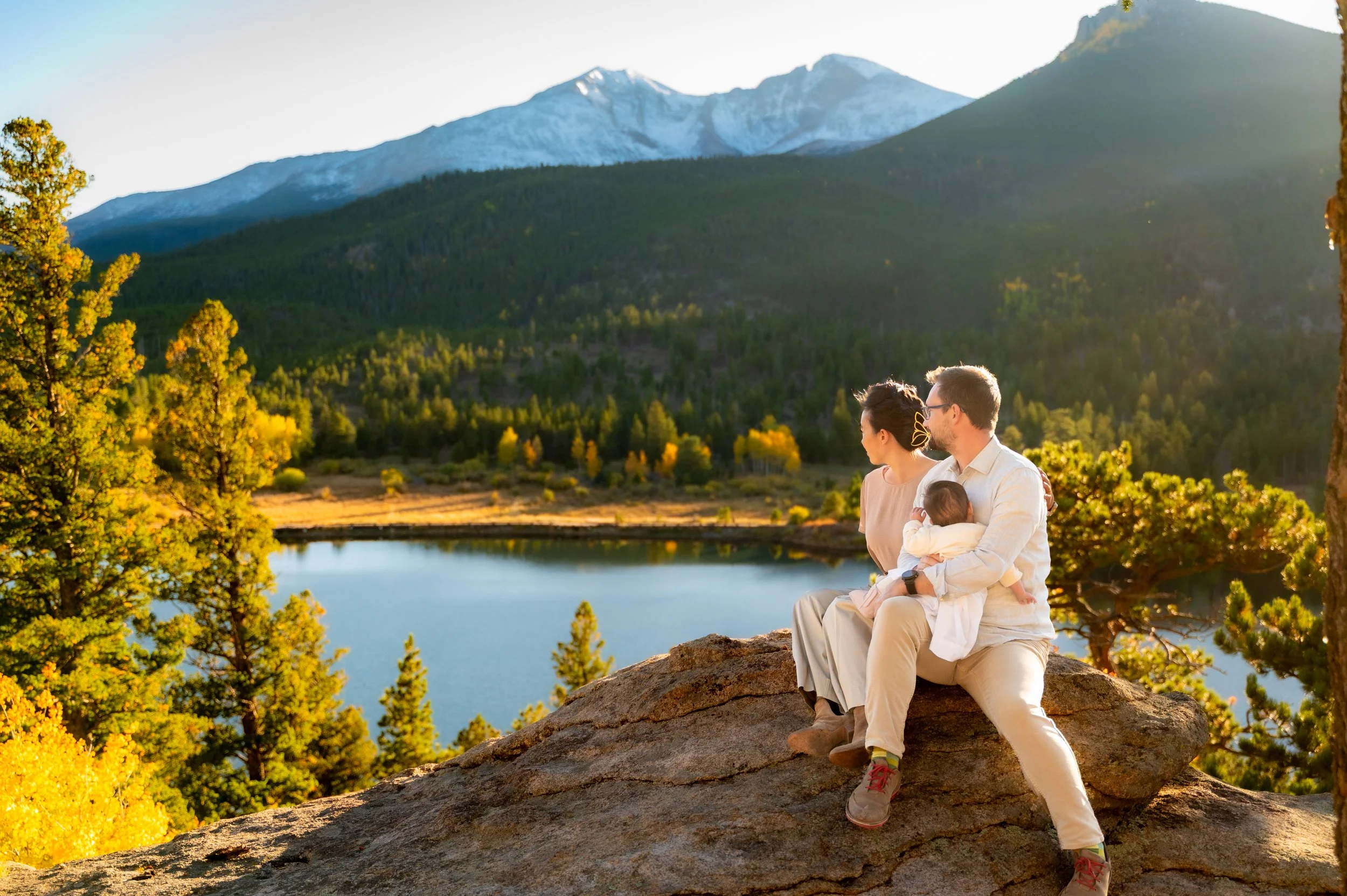
It is imperative that before you choose outfits that you know where your family pictures will be taken. This is because your outfits should complement your surroundings and be in harmony with them. When considering how your outfits will mesh with your location, you’ll want to take into account the season as well. Locations can look drastically different depending upon the season. For example, during the spring a location might have a prominent flower in bloom. During the summer, it might be really green and lush. In the fall, it might have vibrant reds and oranges. And in the winter, the blue sky might be the most prominent feature. Your photographer should be familiar with the location and what colors will be dominant at what times of year.
I’d also take into account the features of the location. Water can convey a strong serene feeling, especially water that is calm. I would recommend finding outfits that mimic that serene feeling in their flow and colors. If you’re doing a shoot at a playground, I would capitalize the play component and find playful colors that really amplify the feeling of that location. Think about how a location makes you feel and choose colors and styles that make you feel similarly.
Step 2: Choose a Style
Outdoors = Less Formal
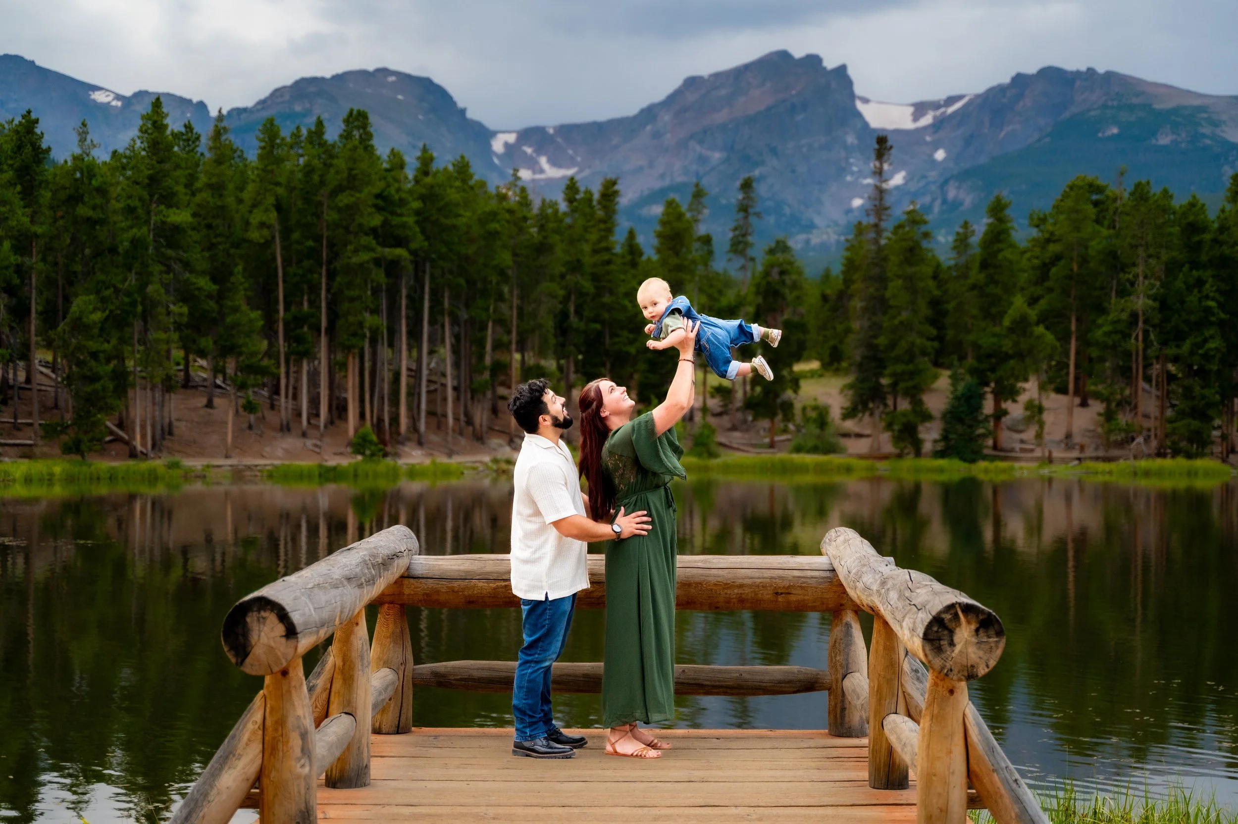
I do family sessions outside and always recommend that my families stick with less formal outfits. This is especially the case with the fact that we’re in Colorado. We are by default less formal in Colorado than many other states. I wouldn’t recommend going completely casual though. Family pictures are a time to dress up. For men, I usually recommend a dark wash jean with a button down top. The season and the individual’s personal style would dictate how closely he’d stick with that. For women, I usually recommend wearing something that you would wear to a nice event outdoors. Depending on your style and how feminine you feel for your session that could be a flowing dress to a set of dark washed jeans and a nice top. For the kids, have them wear something that they can move in and play. We do a lot of playing in our family sessions. But also have it be something that you would be proud of them wearing at a more upscale outdoor event.
Consistent Style
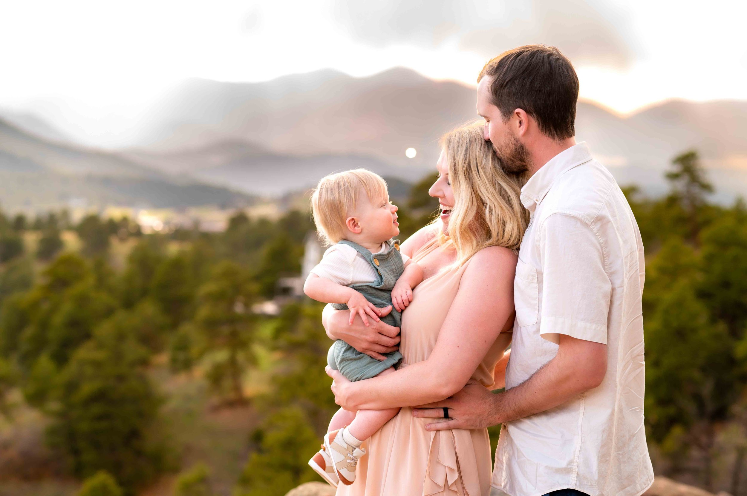
The most important thing to consider when it comes to style is that the entire family is in the same style clothes. That often means having the person who is the pickiest about their clothes choosing their outfit first and then sticking with that style for everyone else in the group. If you’re thinking about buying outfits for your family pictures, the easiest way to make sure you have the same style is to buy all your outfits from the same retailer. The most important feeling we’re trying to convey during family pictures are the idea that you are a devoted unit and clothes can help us to convey that concept.
Step 3: Choose a Color Palette
Now that you have a style in mind, the next step is choosing a color palette. And I do mean a color palette, not just one color. Please, please, please, I implore you to not choose matching outfits. It doesn’t allow your family member’s personalities to shine through and if everyone is wearing the same colors, it just looks like a massive blob of those colors instead of individuals harmoniously together with each individual able to shine. Hmm, “individuals harmoniously together” is kind of an idea representative of a family, isn’t it?
Complementary and Analogous Colors
First, have the pickiest person in your family, or yourself, choose their outfit for the session. What is(are) the prominent color(s) of that outfit? If it is a print, you’ll stick to the colors in the print. If the print is a color and a neutral, then match that color, find analogous or complementary colors for it, and match the neutral. If it is a solid, then start thinking about complementary and analogous colors, as well as complementary neutrals. I highly recommend the color wheel feature on Canva’s website. It is really useful in not only explaining complementary and analogous colors, but also how to find them easily on the color wheel. You can find the tool here: https://www.canva.com/colors/color-wheel/. I also recommend their color palette tool. If you have a picture already that has the colors you’re looking for, it will identify those colors for you: https://www.canva.com/colors/color-palette-generator/.
Neutrals
So what if you want neutrals? Please go right ahead and build some or all of your outfits with neutrals. I absolutely adore neutrals. Gray is my favorite color (or lack of color)!
Combining neutrals
When pairing neutrals with neutrals, only pair like toned neutrals together. Neutrals with yellow undertones (e.g. beiges, creams, and grays with yellow/brown undertones) should be paired only with other neutrals that have yellow undertones. And it’s the same with neutrals with blue undertones. Grays, neutrals, and whites that have blue undertones should be paired only with neutrals with blue undertones. The reason this matters is because yellow and blue are opposites in the world of light. So if you pair a cream with a white, the cream will look really yellow because of how it contrasts with the blue undertones in the white.
Combining neutrals and colors
When combining neutrals with colors, stick with yellow undertones for your neutrals when combining with the warmer colors on the color wheel (e.g. yellow, red, orange, browns, and greens on the yellower side). Stick with blue undertones for your neutrals when combing with cooler colors on the color wheel (e.g. blues, purples, and greens on the bluer side).
Saturation
Lastly, color saturation is important to keep consistent. When using pastels or other low saturation colors, all members of the group should be using them. Highly saturated and bold colors should remain consistent as well. You don’t want to combine a pastel pink with a bold and loud green. Although pink and green are complementary colors, a pastel doesn’t mesh well with a highly saturated and bold green. Another case would be a really dark red and an olive green. Olive green isn’t a pastel, but it is of so low color saturation that it almost borders on neutral.
Step 4: Decide if you want a print
Choose only one print
This is pretty much a hard and fast rule, only choose one print. Two or more prints don’t go together in an ensemble. Think about it. How often do two prints in one outfit work, especially when you’re considering that these outfit choices need to be timeless and classic because they will survive in photographs? If it doesn’t work in the same outfit, it won’t work in a series of of outfits for family pictures either.
Don’t be Matchy-Matchy
This doesn’t mean that everyone should wear the same print. Matchy-matchy, aka choosing a print that everyone wears, is not advised. I used to be a photographer in Hawaii. I can’t tell you how many times I photographed a family where everyone was wearing the exact same Aloha print. It was my nightmare as a family photographer in Hawaii, but I didn’t have the opportunity to speak to my clients beforehand in that setting. When everyone is wearing the same pattern (or the same lack of pattern, as in all the same solid color), it becomes a mass of that pattern/color with floating heads.
Combining Prints and Solid Colors
You don’t need to have a print represented at all, but if a print is chosen it should complement all of the other colors in the ensemble. If you choose a print for a family member, everyone else in the group should have colors that are either in the print (if it is a busy print) or have complementary or analogous colors to the print (if the print is just one color and a neutral).

Prints in more than one outfit
If a print is chosen, it can be replicated in more than one outfit. But no more than one person should have the print be the majority of their outfit. More specifically, the print should not extend beyond one piece in each of those outfits. A great use of integrating a print into more than one outfit would be to have your daughter in a dress in that print and your son in a shirt with that print. Or your daughter is in the dress and you have a scarf in that print. Your daughter is the only one in that print exclusively. Everyone else is integrating it as a secondary pattern in their clothes.
Solids Only
I do want to point out that solids only is completely fine and in fact perfect! Don’t feel like someone in your family needs to wear a print. The rule is only that it should be no more than one print.
Step 5: Choose Accessories
Accessories are a great way to add some style and personality to clothes, as well as adding depth and layers to the outfit so that it looks more finished and put together.
Color
Make sure that your jewelry, sweaters, scarfs, shoes, and hats are also complementary or analogous colors (or neutrals) to the outfits already chosen. Accessories can also be a great way to add a color pop without overwhelming the outfits. A color pop is done with a complementary color. So if you have an ensemble based on blues, yellow is the opposite on the color wheel and would pop.
Texture
Texture adds dimensions to portraits. A highly textured sweater, scarf, or shawl is a great way to add a little bit to your ensemble. A sheer fabric should also not be understated as adding texture, because it shows the layers underneath. Layers and textured fabrics add dimension to your clothes. Dimension makes photographs pop.
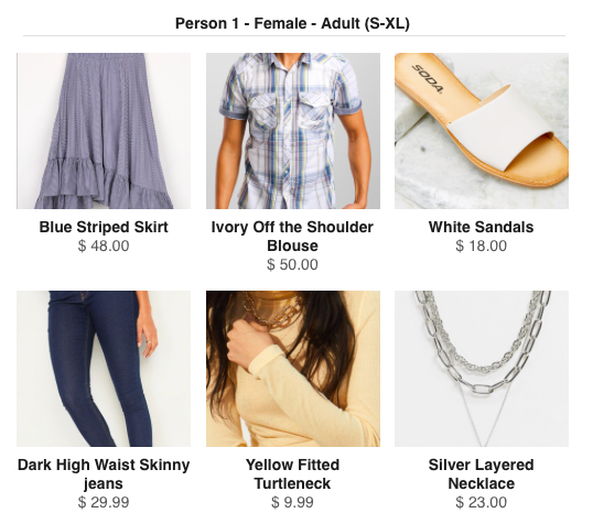
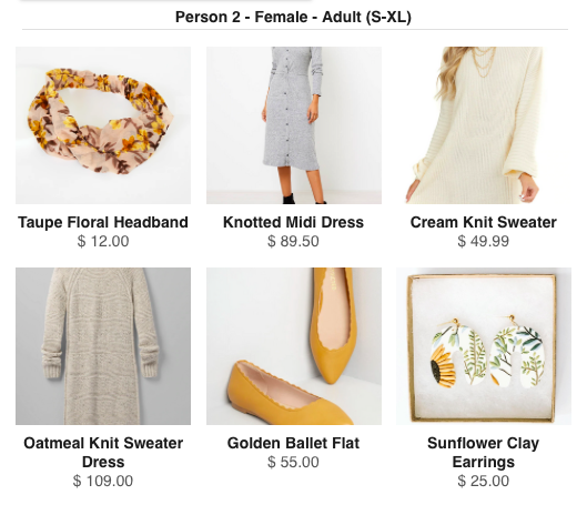
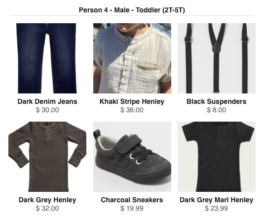
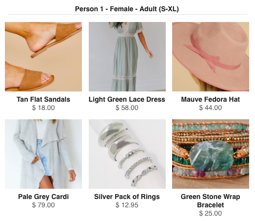
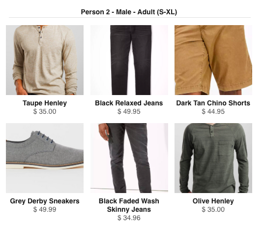
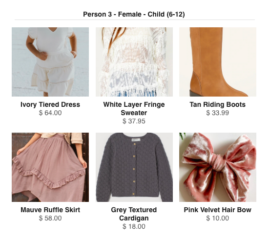
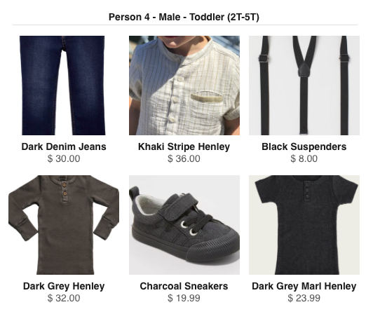
If you’re in need of some inspiration. Here are some outfit ensembles I put together in Style and Select. The first is for two adult women and a male child. The second is for a male adult, female adult, female child, and male toddler.
P.S. If you’re one of my clients and want colors that pop, you’ll probably want to stay in the world of neutrals or cool color tones. My editing style actually tones down warm colors like yellow, orange, and red. This should affect your choice of colors in two ways. If you choose a warmer tone, that is totally fine and actually a wonderful choice. Just know that the color will be less vibrant with my editing style. If you choose a color that is somewhere in between cool and warm tones, such as teal, the color will appear cooler in my photographs than it does in real life. In the case of teal, it will be closer to a blue. In the case of neutrals, creams and off white colors will appear more white in my images. And if you want a color that pops, blue is the way to go!
P.S.S. Feeling a little overwhelmed? Don’t worry. That’s what your photographer is here for. Your family photographer should be helping you to decipher all of this. It is part of the portrait and just as important as choosing location and poses.
Sara Herkes is a maternity, newborn, and family photographer based in Longmont, CO. She serves the the Denver Metro Area, the Colorado Rockies, and the Northern Front Range and captures your pregnancy amidst the Colorado wilderness. Learn more about her services here.
The Ultimate Family Photography Guide

Check Out These Blog Posts Below